| ID | Element |
|---|---|
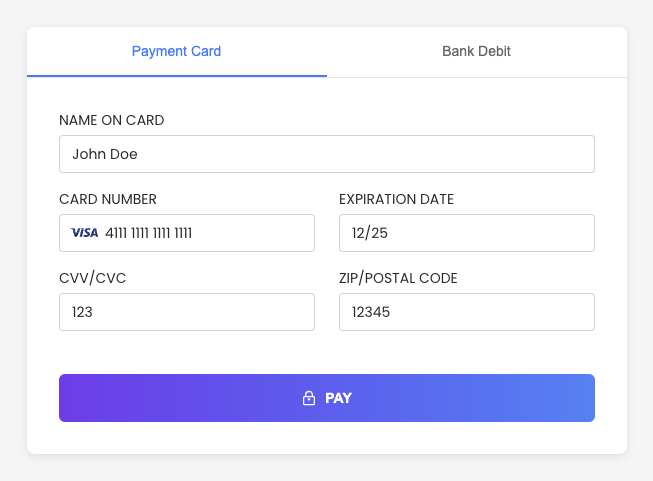
| `cardNumber` | Card number input |
| `cardNumberContainer` | Card number container |
| `cardExpirationDate` | Card expiration date input |
| `cardExpirationDateContainer` | Card expiration date container |
| `cardCvv` | Card CVV input |
| `cardCvvContainer` | Card CVV container |
| `cardZipcode` | Card zip code input |
| `cardZipcodeContainer` | Card zip code container |
| `cardHolderName` | Cardholder name input |
| `cardHolderNameContainer` | Cardholder name container |
| `achAccountType` | Bank account type selector |
| `achAccountTypeContainer` | Bank account type container |
| `achAccountHolderName` | Bank account holder input |
| `achAccountHolderNameContainer` | Bank account holder container |
| `achRouting` | Bank routing input |
| `achRoutingContainer` | Bank routing container |
| `achAccount` | Bank account input |
| `achAccountContainer` | Bank account container |
| Row 0 | Size=1 | Size=1 | Size=1 | Size=1 | Size=1 | Size=1 | Size=1 | Size=1 | Size=1 | Size=1 | Size=1 | Size=1 |
| Row 1 | Size=2 | Size=3 | Size=5 | Size=1 | Size=1 | |||||||
| Row 2 | Size=8 | Size=4 |
 ## Handle responses and errors
The embedded components return response objects to callback functions that you define in the component configuration.
You can use these callback functions to handle responses and errors, such as displaying messages to users.
There are four possible callback functions that are triggered based on the component's state:
* `functionCallBackSuccess`: Triggered for successful transactions (2XX responses) and declined transactions (4XX responses).
* `functionCallBackError`: Triggered for validation errors.
* `functionCallBackReady`: Triggered when the component is ready to process a transaction.
* `functionCallBackCancel`: Triggered when the user closes the component's modal.
### Callback support reference
The callback functions supported are different for each component type.
The following table shows which callback functions are supported by each component type:
## Handle responses and errors
The embedded components return response objects to callback functions that you define in the component configuration.
You can use these callback functions to handle responses and errors, such as displaying messages to users.
There are four possible callback functions that are triggered based on the component's state:
* `functionCallBackSuccess`: Triggered for successful transactions (2XX responses) and declined transactions (4XX responses).
* `functionCallBackError`: Triggered for validation errors.
* `functionCallBackReady`: Triggered when the component is ready to process a transaction.
* `functionCallBackCancel`: Triggered when the user closes the component's modal.
### Callback support reference
The callback functions supported are different for each component type.
The following table shows which callback functions are supported by each component type:
| Component | Callback |
|---|---|
| EmbeddedMethod UI | functionCallBackSuccess, functionCallBackReady, functionCallBackError |
| PayMethod UI | functionCallBackSuccess, functionCallBackError |
| VirtualTerminal UI | functionCallBackSuccess, functionCallBackError |
| ExpressCheckout UI | functionCallBackSuccess, functionCallBackReady, functionCallBackError, functionCallBackCancel |