This guide covers setting up a custom app for processing boarding applications using example code, including modifying the form layout, applying a custom theme, and changing individual form fields. The result is a custom app that’s catered towards private corporations with a fulfillment window of 30 days or less on all transactions and a minimum average transaction amount of $100 USD.

Hosting your own boarding solution means that you’re responsible for maintaining it. Talk to your Payabli solutions engineer about whether API-driven boarding is a good option for your organization.

Visit the repository’s README for information about specific files, functions, component props, and other technical details.

Dependencies

Before you begin, make sure you have the following installed on your machine:

Set up the app

Run these commands in your terminal to configure the boarding example app on your local machine:

1

Clone the repo

git clone https://github.com/payabli/examples
2

Navigate to the app directory

cd examples/boarding
3

Install the dependencies

npm install
4

Copy the environment template

cp .env.template .env
5

Fill in your environment variables

Open the .env file in your code editor. Set PAYABLI_API_TOKEN to your Payabli API token and BETTER_AUTH_SECRET to any text string with a length of 32 characters:

# your Payabli API token
PAYABLI_API_TOKEN="123...XYZ"
# what Payabli environment to use
PAYABLI_ENVIRONMENT="sandbox"
# your better-auth secret
BETTER_AUTH_SECRET=ABCDEFGHIJKLMNOPQRSTUVWXYZ123456
# base URL of your app
BETTER_AUTH_URL=http://localhost:4321 # https://my-production-site.com

The BETTER_AUTH_SECRET is a string used to encrypt sensitive information. You can generate a 32-character string using the secret key generator in the better-auth documentation. The BETTER_AUTH_URL is the base URL of your app.

6

Set up better-auth

Say “yes” to all prompts:

npx @better-auth/cli generate
npx @better-auth/cli migrate
7

Start the development server

npm run dev

Authentication

The example boarding app uses a JavaScript library called better-auth for user authentication. Authentication is important because it prevents access to secure information by unauthorized users.

1

Open your app

Navigate to http://localhost:4321 in your web browser to see the login page.

Login Page

2

Sign up

Click the “Sign up” link to create a new account.

Login Page

3

Authenticate

After you sign up, you’ll be authenticated and see the boarding form.

Boarding Example App

Move form fields

The <WizardStep> component represents one step in the form wizard, and its code contents are displayed as the form’s current tab. By default, the form has several steps:

  • Business Information
  • Business Details
  • Contacts & Ownership
  • Financial Information
  • Payment Information

The bsummary (business summary) field is in the “Financial Information” step. Let’s move it to the “Business Information” step.

1

Find the "Financial Information" section

In your code editor, navigate to src/components/PayabliForm.tsx. Find the <WizardStep> component with a label value of "Financial Information".

<WizardStep icon={<Banknote />} label="Financial Information">
    <h2 className="mb-4 w-full text-center text-2xl font-bold">
      Step 4: Financial Information
    </h2>
    <div className="items-end gap-4 md:grid md:grid-cols-2">
    <FormInput
      name="bsummary"
      label="Business Summary"
      tooltip="Brief description of your business activities"
    />
    ...
2

Delete the `bsummary` form field

Under the <WizardStep> component, delete the <FormInput/> component with a name value of "bsummary":

<WizardStep icon={<Banknote />} label="Financial Information">
    <h2 className="mb-4 w-full text-center text-2xl font-bold">
      Step 4: Financial Information
    </h2>
    <div className="items-end gap-4 md:grid md:grid-cols-2">
    {/* deleted form input for bsummary */}
    ...
3

Find the "Business Information" section

Scroll up and find the <WizardStep> component with a label of "Business Information":

<WizardStep icon={<Building />} label="Business Information">
  <h2 className="mb-4 w-full text-center text-2xl font-bold">
    Step 1: Business Information
  </h2>
  <div className="items-end gap-4 md:grid md:grid-cols-2">
    <FormInput
      name="legalname"
      label="Legal Name"
      tooltip="The official registered name of your business"
    />
    ...
4

Make a new `bsummary` form field

Make a new <FormInput/> component here with a name value of "bsummary".

<WizardStep icon={<Building />} label="Business Information">
  <h2 className="mb-4 w-full text-center text-2xl font-bold">
    Step 1: Business Information
  </h2>
  <div className="items-end gap-4 md:grid md:grid-cols-2">
    <FormInput
      name="legalname"
      label="Legal Name"
      tooltip="The official registered name of your business"
    />
    <FormInput
      name="bsummary"
      label="Business Summary"
      tooltip="Brief description of your business activities"
    />
    ...
5

Save changes

Save the file and refresh the page. You should see the “Business Summary” field in the “Business Information” section.

Business Summary Moved

Change section details

Let’s give the “Business Information” section a new name and a new icon.

1

Find the "Business Information" section

Go back to the <WizardStep> component with a label of "Business Information":

<WizardStep icon={<Building />} label="Business Information">
    <h2 className="mb-4 w-full text-center text-2xl font-bold">
      Step 1: Business Information
    </h2>
    ...
2

Change step props

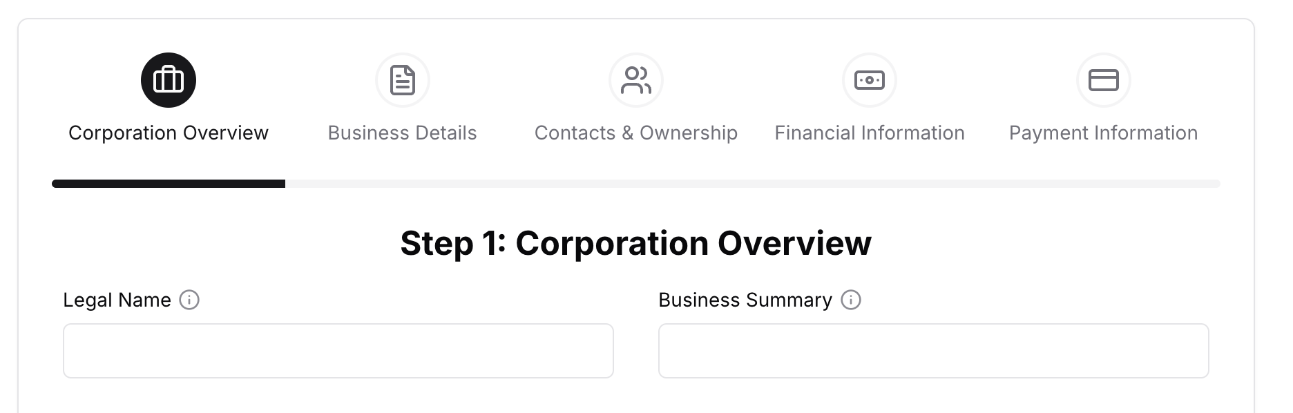
Change the label prop to "Corporation Overview", then change the icon prop from {<Building />} to {<Briefcase />}:

<WizardStep icon={<Briefcase />} label="Corporation Overview">
    <h2 className="mb-4 w-full text-center text-2xl font-bold">
      Step 1: Business Information
    </h2>
    ...
3

Edit header title to match

Finally, change the <h2> element below to match the new label prop: “Step 1: Corporation Overview”:

<WizardStep icon={<Briefcase />} label="Corporation Overview">
    <h2 className="mb-4 w-full text-center text-2xl font-bold">
      Step 1: Corporation Overview
    </h2>
    ...
4

Save changes

Your <WizardStep> component should say “Corporation Overview” and have a briefcase icon.

Corporation Overview Section

The icons in this example app use a library called lucide. You can find a list of all available icons on their website. Lucide icons must be imported at the top of the file. Scroll to the top of the file and find the import list from lucide-react. Add a new line at the top of the list that says Briefcase,.

Add form validation rules

Form fields need to validate input data. For example, the email field should have a valid email. If the user enters an invalid email, the form should display an error message. The form schema in src/Schema.ts contains the validation rules.

The Schema.ts file is also where the templateId field is located. If you need to change the boarding template, change the value inside of the .default() method.

We need to add a validation rule to prevent the form from accepting an average transaction value less than $100 USD.

1

Find the form field entry in the schema

Go to src/Schema.ts and find the ticketamt entry:

ticketamt: requiredNumber(),
2

Add a validation rule

Add a new validation rule with the .min() method and a new error message to indicate the minimum amount.

ticketamt: requiredNumber().min(100, { message: 'Ticket amount must be at least $100' }),

Entering a value less than 100 in the ticketamt field now displays an error message.

Remove form fields

Let’s remove the form field that asks for the business type, because your application is only used by private corporations.

1

Remove the form field component

In src/components/PayabliForm.tsx, delete the <FormSelect/> component with the name prop set to "btype":

<WizardStep icon={<Building />} label="Business Information">
  ...
  <FormSelect
    name="btype"
    label="Business Type"
    options={[
        { value: 'Limited Liability Company', label: 'Limited Liability Company' },
        { value: 'Non-Profit Org', label: 'Non-Profit Org' },
        { value: 'Partnership', label: 'Partnership' },
        { value: 'Private Corp', label: 'Private Corp' },
        { value: 'Public Corp', label: 'Public Corp' },
        { value: 'Tax Exempt', label: 'Tax Exempt' },
        { value: 'Government', label: 'Government' },
        { value: 'Partnership', label: 'Partnership' },
        { value: 'Sole Proprietor', label: 'Sole Proprietor' },
    ]}
    tooltip="The legal structure of your business"
  />
  ...
/>
2

Find the form field entry in the schema

Because you deleted the form field that controls the btype value, you need to set a default btype value to send with the boarding application. Navigate to src/Schema.ts and find the btype entry towards the top of the page:

btype: requireString(),
3

Add default value in the schema

Use the .default() method to add a default value of "Private Corp":

btype: requireString().default("Private Corp"),

All new submissions will set the btype field to a value of "Private Corp".

Removing form fields and providing default values is effectively the same as prefilling the form field with a default value, as can be done with Payabli’s hosted boarding solutions. See Prefill Applications.

Customize form inputs

Because the ticketamt form field doesn’t accept values less than 100, we need to tell the user that there is a minimum amount of $100 USD. We can do this by editing the <FormInput/> component for the ticketamt field.

1

Find the form input

In src/components/PayabliForm.tsx, find the <FormInput/> component with a name prop set to "ticketamt":

<FormInput
  name="ticketamt"
  label="Average Ticket Amount"
  tooltip="Average amount per transaction"
  prefix="$"
  numeric
/>
2

Edit the props

Edit the label and tooltip props to include the minimum amount:

<FormInput
  name="ticketamt"
  label="Average Ticket Amount ($100+)"
  tooltip="Average amount per transaction (min. $100)"
  prefix="$"
  numeric
/>

To configure autocompletion for form fields, such as for addresses, see the README. We recommend using an address autocompletion service like Google Places or Smarty for production applications.

Customize form selects

Because this app is for private corporations with a fulfillment window of 30 days or less, we need to edit the whenDelivered and whenRefunded form fields.

1

Find the form select

In src/components/PayabliForm.tsx, find the <FormSelect/> component with a name prop set to "whenDelivered".

<FormSelect
  name="whenDelivered"
  label="When Delivered"
  options={[
    { value: '0-7 Days', label: '0-7 Days' },
    { value: '8-14 Days', label: '8-14 Days' },
    { value: '15-30 Days', label: '15-30 Days' },
    { value: 'Over 30 Days', label: 'Over 30 Days' },
  ]}
  tooltip="Typical timeframe for delivering products or services"
/>
2

Edit the `options` prop

Delete the last option that has a value and label of 'Over 30 Days'.

<FormSelect
  name="whenDelivered"
  label="When Delivered"
  options={[
    { value: '0-7 Days', label: '0-7 Days' },
    { value: '8-14 Days', label: '8-14 Days' },
    { value: '15-30 Days', label: '15-30 Days' },
    // deleted option
  ]}
  tooltip="Typical timeframe for delivering products or services"
/>
3

Repeat for `whenRefunded`

Do the same for the whenRefunded field.

<FormSelect
  name="whenRefunded"
  label="When Refunded"
  options={[
    { value: 'Exchange Only', label: 'Exchange Only' },
    { value: 'No Refund or Exchange', label: 'No Refund or Exchange' },
    { value: '30 Days or Less', label: '30 Days or Less' },
    // deleted option
  ]}
  tooltip="Typical timeframe for processing refunds"
/>

To learn more about the available props for the form components, see the README.

Customize shadcn/ui themes

The example boarding application is built with a UI library called shadcn/ui. This makes the application easy to customize with themes.

1

Find the theme styles

In your code editor, navigate to src/styles/globals.css. The first @layer base { ... } block determines the theme.

@tailwind base;
@tailwind components;
@tailwind utilities;

@layer base {
  :root {
    // light mode styles
  }

  .dark {
    // dark mode styles
  }
}
2

Open the shadcn/ui theme generator

Instead of manually editing all of the values, you can use the shadcn/ui theme builder to generate them for you.

3

Generate new theme styles

Click the “Customize” button, select your options, and then click the “Copy code” button. It will give you a new @layer base { ... } block that you can paste over the first @layer base { ... } block in src/styles/globals.css.

4

Save changes

Congratulations! You have a new theme.

Using the shadcn/ui theme builder

Was this page helpful?