Embedded component playground
The Embedded Component Playground is a live test environment that lets you edit configurations, test themes and component types, and change up styling on the fly. The Playground aims to dramatically boost your developer productivity.
Every code change gets instant feedback from the live coding environment. You can even choose to open your work in Code Sandbox, where you can download the code and integrate into your project or work with friends.
Check out the Playground to get started!
Using the Playground
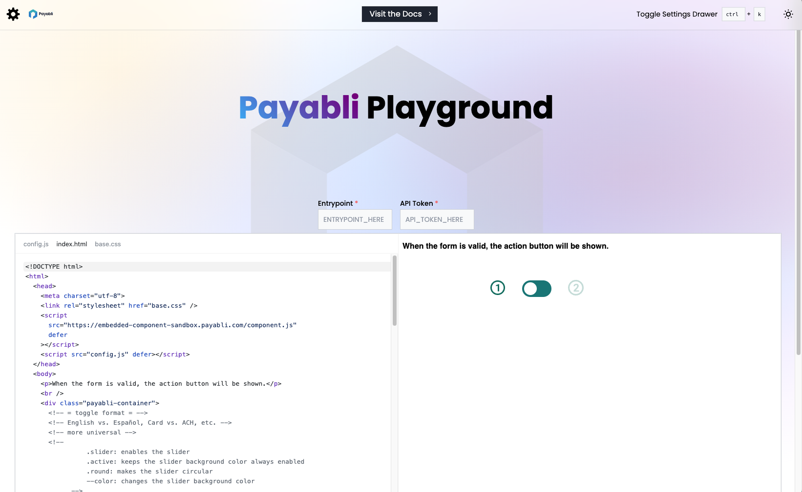
Using the Playground is a breeze. Go to https://playground.payabli.com and add your Payabli entrypoint and API token values. After you’ve done that, your component renders in real time and you can work on configuring it.
Configuration drawer
Open the configuration drawer by clicking the gear icon on the top left or using the keyboard shortcut [Ctrl + K].
The drawer contains several helpful options to help you craft your component.
Component Type
Choose the type of component you want to use. The most popular and flexible option is EmbeddedMethod, but PayMethod is available too.
Switcher (EmbeddedMethod only)
This determines which UI preset to use to switch between configurations, such as Card or ACH payments.
Configuration
Controls what type of data the component will display, such as payment type, input field names, accepted card brands, and more.
Experimenting with the code
After you’ve set up your component’s basic options, it’s time to start experimenting with the code directly. In the code editor, there are three files which each control different functions:
index.html
This file contains the setup that links your configuration and style together, and also contains the switcher mechanism and trigger buttons.
config.js
This file contains the configuration for your component, like payment methods and input field names. For demo purposes in the Playground, it also contains the CSS to style the container and input fields.
When you implement your own component, we strongly recommend that you export your theme’s CSS to an external file and link it to your component using customCssUrl.
Next steps
Go ahead and experiment with the Playground. When you’re done, you can either copy the content from the editor or open your work in Code Sandbox to download it.