Embedded components overview
Payabli offers a set of embedded JavaScript UI components that let you create customized checkout experiences without handling sensitive payment information. You can use the embedded components to process transactions or save payment methods while remaining PCI compliant. Payment methods saved via the embedded components can be used with the Payabli API to perform functions like subscriptions, queries, and more. See Tokenization Overview for more information.
Choose a component
Use the interactive quiz below to find the right embedded component for your application.
To decide which embedded component to use, consider the functionality you need for your app. Payabli offers embedded components tailored to different use cases:
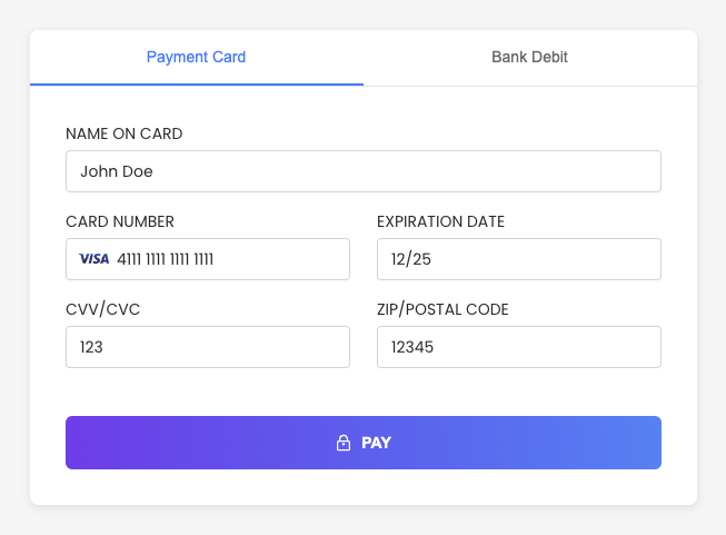
Capture a payment method or make a sale using any payment method. This is the most flexible component. It’s ideal for tokenizing payment methods or making sales directly from your page.
Add acceptance for digital wallet payments like Apple Pay. It can be paired with other components to give your customer a range of options.
Embed a virtual terminal tool in your page or app, letting you add secure payment acceptance in a contained environment.
Save payment method data without expanding your PCI scope. This component is a modal that opens over content, and is designed only for storing payment methods.
Which component is right for you depends on whether you need to make transactions, save payment method data, or both. For example, if you need to both save a payment method and execute payments, the EmbeddedMethod UI might be the best choice. If you just need to make transactions from your website or app, the VirtualTerminal UI could be the right choice. Overall, the EmbeddedMethod UI is the most popular and flexible option.
You can extend the EmbeddedMethod UI and PayMethod UI components even further by using a flow designed around returning a temporary payment token. See Extend Embedded Components with the Temporary Token Flow for more.
Usage
Payabli’s embedded components are customizable and easy to implement.
To load Payabli’s embedded components, add a script tag that points to Payabli’s component.js library.
After adding the script tag, create an instance of the PayabliComponent class with your configuration.
See the Configuration reference for each component for more information about configuration options.
Library URLs
See the component.js Changelog to see the latest changes.
Beginning October 22, 2023 embedded components no longer supports versions older than 1.9.0.
The sandbox and production library URLs are evergreen, meaning that the URL always points to the latest version.
- Sandbox:
https://embedded-component-sandbox.payabli.com/component.js - Production:
https://embedded-component.payabli.com/component.js
You must add the data-test configuration variable to your script tag when using the sandbox library. Don’t include data-test when working with the production library.
Authentication
Payabli’s embedded components authenticate with the token field passed in the embedded component’s configuration.
The API token must be a public token. If you are using a Creator component, the API token must be set up for the Creator.
See Payabli API tokens for more information.
PayabliComponent class
The PayabliComponent class has the following methods:
Show the component if it’s hidden.
Hide the component.
Replace the component configuration.
Trigger an action. Valid actions are method, pay, auth and reinit. parameters is an optional structure that lets you dynamically overwrite the matching fields passed via configuration for customerData and paymentDetail.
actions
This action executes a tokenization of the payment information (saves the payment method). This action doesn’t process a payment. This is the default action.
This action processes a payment.
This action processes an authorization that needs to be captured later. This action doesn’t process a payment.
This action resets the component state. We recommend using this method when the component is in an error or declined state and you want to retry a transaction.
Customize styles
To customize the component’s styles, you can pass a URL to a CSS file in the customCssUrl parameter of the component configuration.
Make the component background transparent
By default, the embedded components have a white background. To make the component’s background transparent, add the following CSS to the stylesheet that’s linked with the customCssUrl parameter:
Component containers
The embedded components are loaded inside of an iframe. Each component creates a container for the iframe with a specific ID. You can use these IDs to target the component container in your CSS or JavaScript code. Here are the IDs for each component:
- EmbeddedMethod:
payabliComponentsIframeContainerMethodEmbedded - PayMethod:
payabliComponentsIframeContainerMethod - VirtualTerminal:
payabliComponentsIframeContainerEterminal - ExpressCheckout:
payabliComponentsIframeContainerExpressCheckout
Component elements
You can also reference specific elements inside of the component and create custom styles for them. The elements inside the component have the following IDs:
This example targets the card number, expiration date, CVV, ZIP code, and cardholder name fields. It adds a solid, 1 pixel black border to the fields.
Customize input fields
The input fields inside of the component can be styled individually via the component’s configuration object.
Input grid layout
The component’s inputs are laid out in a grid with 3 rows and 12 columns.
You can specify size and placement of each input in the grid without any CSS by using the row, order, and size fields.
Input configuration reference
You can style inputs in the component configuration using the following parameters:
Label for input field.
Placeholder for input field.
Enable/disable floating label within input field.
Value for input field.
Size of input field in columns (1-12).
Row to place the input within component grid (0-2), 0 being the top row.
Order of input field within the row (0-99+), 0 being the left position.
For achRouting and achAccount inputs only. When true, duplicates the ACH account number and routing number fields and requires that the fields match. This helps make sure the user enters valid account and routing numbers. Only available for the EmbeddedMethod UI.
For cardZipcode input only. Accepted values are us and ca. Controls which zip code formats are accepted. If ca is included, then Canadian payments are enabled.
Input configuration examples
Here are some examples of different input configurations:
Interactive demos
The following demos show the EmbeddedMethod UI component with different configurations.
Card
This is a basic example of the EmbeddedMethod UI component with default card configuration. This demo shows the component in action with transaction processing and visual feedback. When the component processes a transaction, the demo displays the JSON response.
ACH
This is a basic example of the EmbeddedMethod UI component with default ACH configuration. This demo shows the component in action with transaction processing and visual feedback. When the component processes a transaction, the demo displays the JSON response.
RDC
This is a basic example of the EmbeddedMethod UI component with default RDC configuration. This demo shows the component in action with transaction processing and visual feedback. When the component processes a transaction, the demo displays the JSON response.
Customized
This is an example of the EmbeddedMethod component with customized input fields and configuration switching logic. See the Interactive demo for EmbeddedMethod UI for a live preview of this example.
Handle responses and errors
The embedded components return response objects to callback functions that you define in the component configuration. You can use these callback functions to handle responses and errors, such as displaying messages to users.
There are four possible callback functions that are triggered based on the component’s state:
functionCallBackSuccess: Triggered for successful transactions (2XX responses) and declined transactions (4XX responses).functionCallBackError: Triggered for validation errors.functionCallBackReady: Triggered when the component is ready to process a transaction.functionCallBackCancel: Triggered when the user closes the component’s modal.
Callback support reference
The callback functions supported are different for each component type. The following table shows which callback functions are supported by each component type:
Declined transactions
For a declined transaction, the functionCallBackSuccess callback is triggered.
To determine whether a transaction was successful or declined, check the responseText field in the response object.
A successful transaction returns "Success" in the responseText field, and a declined transaction returns "Declined".
After a declined transaction, we recommend calling the payabliExec("reinit") method to reinitialize the component so that the user can try again.
This example shows how to handle successful transactions, declined transactions, and internal Payabli processing errors. See the Response reference for each component to see more information about the response object.
See Payment response codes and errors for more information about server errors and response codes.
Error handling
The functionCallbackError callback is triggered for validation errors.
You can use this callback to display custom error messages to users or log errors for debugging.
The functionCallBackError callback has a different response object based on the component type:
- EmbeddedMethod UI, PayMethod UI, VirtualTerminal UI:
functionCallBackErrorresponse - ExpressCheckout UI: ExpressCheckout UI documentation.
Playground
The Embedded Component Playground lets you experiment with some component types with a live preview in your browser.
Related resources
See these related resources to help you get the most out of Payabli.
Next steps
- EmbeddedMethod UI - Learn how to use the EmbeddedMethod UI embedded component to add the ability to securely store a payment profile or execute a sale
- ExpressCheckout UI - Learn how to use the ExpressCheckout UI component on your site or in your app to securely accept digital wallet payments
- Embedded components framework integrations - Learn how to use Payabli’s embedded components with front-end frameworks like React and Vue
- PayMethod UI - Learn how to use the PayMethod UI embedded component to securely store a payment profile with a low-code modal-based UI.
- VirtualTerminal UI - Learn how to use the VirtualTerminal UI component on your site or in your app to securely accept payments
References
- Payment methods for testing - Use these payment methods to test your integration with Payabli
- Payment response codes and errors - Learn about payment response codes for different payment methods