PayMethod UI
Learn how to use the PayMethod UI embedded component to securely store a payment profile with a low-code modal-based UI.
Before integrating with this component, we highly recommend reading Embedded Components Overview to make sure you select the right component for your use case, authenticate properly, and understand how to style the components.
This page covers only the configuration unique to this component, and doesn’t cover all the basic usage for embedded components.
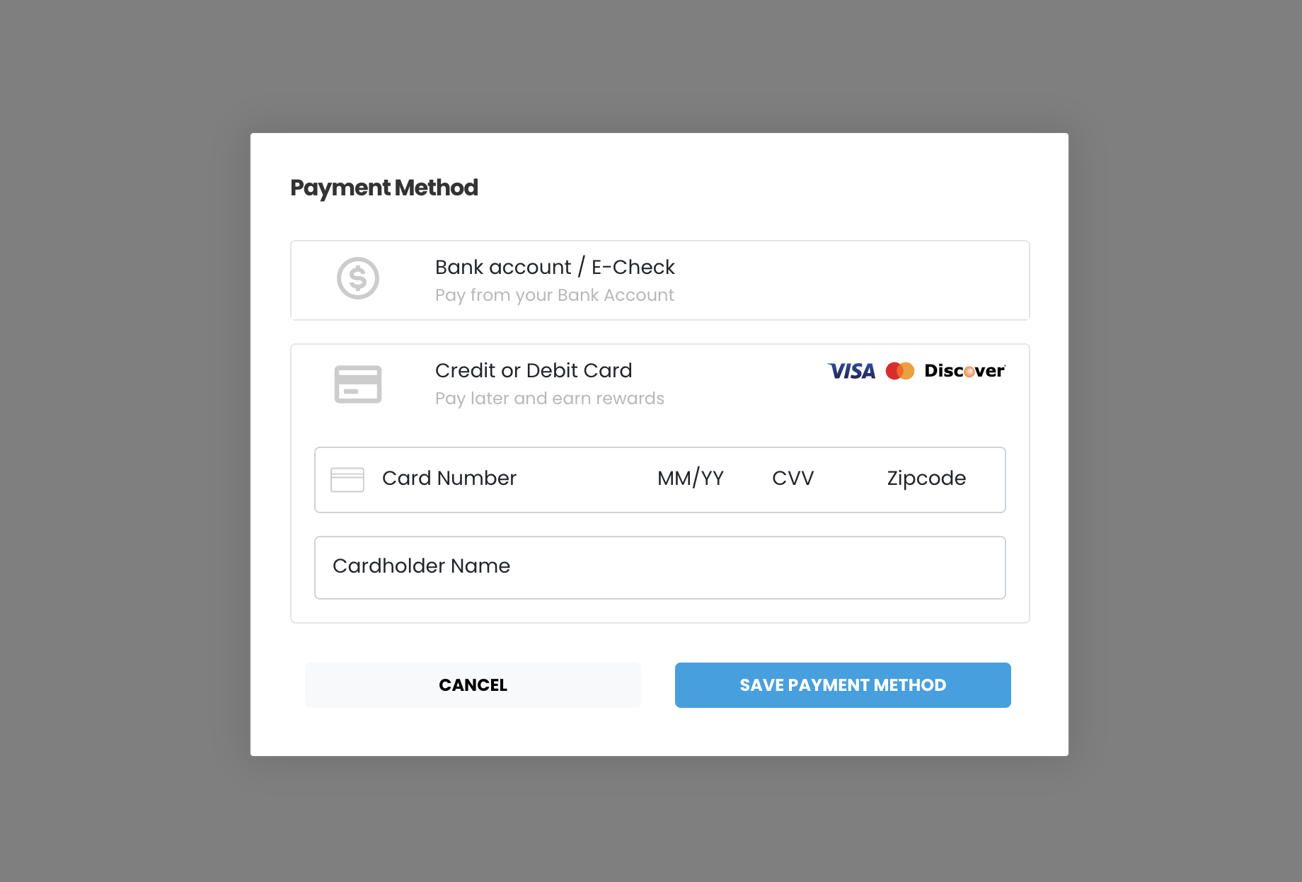
Use the PayMethod UI component to open a modal that captures a customer payment method for tokenization.
The captured payment method is returned as an ID.
Use the ID make future transactions via API with the storedMethodId field.
This component is supported in the Playground. Use the Embedded Component Playground to edit and design embedded components in real time, and export the code to use in your own site or app.
Usage
The PayMethod UI component is a modal that’s displayed over content and can be triggered via an event listener or function. Use the interactive demo to see how the component works, then follow the configuration walkthrough to set it up in your project.
See Library URLs for important information about embedded components library URLs.
Interactive demo
This demo shows the component in action with transaction processing and visual feedback. When the component processes a transaction, the demo displays the JSON response.
Configuration walkthrough
The interactive walkthrough displays code examples alongside step-by-step explanations.
Configuration reference
These are the configuration parameters available for the PayMethod component. If you need to pass more than data than what’s supported, consider using the temporary token flow. See Temporary Token Flow for more information.
This value determines the type of embedded component to render.
Accepted values are: methodEmbedded, methodLightbox, vterminal, or expressCheckout.
For the PayMethod UI, this value is methodLightbox.
See the Embedded Components Overview for more information on other component types.
Container ID used for the component.
Sets the default payment method that’s shown. Accepted values are: card or ach.
Text label for the action button.
When true the component is hidden when it’s instanced.
API token for authentication.
When true, the component uses the customerData object to create a new customer record.
When temporaryToken is true and forceCustomerCreation is false, the component doesn’t create a new customer record.
See Temporary Token Flow for more information.
Complete URL of a custom CSS stylesheet to use with the component.
When true, the token created for the payment is temporary. Set this parameter to false to create a storedMethodId and save the payment profile.
cardService object used to configure accepted card types.
properties
Enable/disable card option.
Enable/disable acceptance of American Express cards.
Enable/disable acceptance of Discover cards.
Enable/disable acceptance of Visa cards.
Enable/disable acceptance of MasterCard cards.
Enable/disable acceptance of Diner’s Club cards.
Enable/disable acceptance of JCB cards.
Card input fields descriptors. This object applies only to the EmbeddedMethod UI component.
properties
Optional, but strongly recommended. Descriptor object for input field.
Descriptor object for input field.
Descriptor object for input field.
Descriptor object for input field.
Optional, but strongly recommended. Descriptor object for input field.
achService object used to configure accepted ACH types.
properties
Enable/disable ACH option.
Enable/disable acceptance of Checking account.
Enable/disable acceptance of Savings account.
When set to true, the embedded component will validate ACH account and routing numbers in real time. This is an add-on feature. Contact the Payabli team for more information.
ACH input field descriptors. This only applies to the EmbeddedMethod UI component.
properties
Required. Descriptor object for input field.
Required. Descriptor object for input field.
Required. Descriptor object for input field. Use the
confirm input descriptor to add matching validation to this field. See Style Individual Fields for more.
Required. Descriptor object for input field. Use the
confirm input descriptor to add matching validation to this field. See Style Individual Fields for more.
paymentMethod object with data related to the payment method. Required when saving a payment method or executing a payment. Can be passed to the component via payabliExec method.
Customer Object with data related to customer. Can be passed to the component via payabliExec method. Required when saving a payment method. Which fields are required depends on whether the paypoint has custom identifiers. If you aren’t using custom identifiers, then you must include at least one of these values: firstname and lastname, email, or customerId.
When true, if tokenization fails, Payabli will attempt an authorization transaction to request a permanent token for the card. If the authorization is successful, the card will be tokenized and the authorization will be voided automatically.
The amount for the fallbackAuth transaction. Defaults to one dollar.
The callback function called when the component executes successfully.
The callback function called when the component receives an error. See functionCallBackError response in the next section for a complete reference.
Response
The embedded component returns a response object to the callback functions defined in the configuration. The response object contains the result of the transaction (success, declined, or error) and details about the transaction.
Response examples
Click the tab to see an example response returned by the embedded component for each result.
Response reference
The response object passed to a callback function has the following structure:
“Success” or “Declined”
Container for response details.
properties
Identifier for the transaction (for payments) or the stored payment method (for save payment method).
The referenceId is used as the storedMethodId in other operations.
See Handling responses and errors for more.
Result of operation. 1 is success, 2 is declined, and 3 is error.
Message related the result. If the operation was successful, it returns “Added”/“Approved”. If there was an error, it returns error details.
ID for the customer owner of payment or saved payment method.
Identifier for stored payment method for saved payment methods.
This field has a value of null for payment transactions.
The methodReferenceId is used as the storedMethodId in other operations.
See Handling responses and errors for more.
functionCallBackError response
The functionCallBackError function is called when the component can’t validate the payment information before submitting it to Payabli’s API.
The response object passed to functionCallBackError contains an array with codes, keys, and descriptions of failed validations.
You can check the values in the array to offer your customized error message.
Related resources
See these related resources to help you get the most out of Payabli.
Prerequisites
- Embedded components overview - Learn how to use Payabli’s embedded components to create customized checkout experiences without handling sensitive payment information yourself